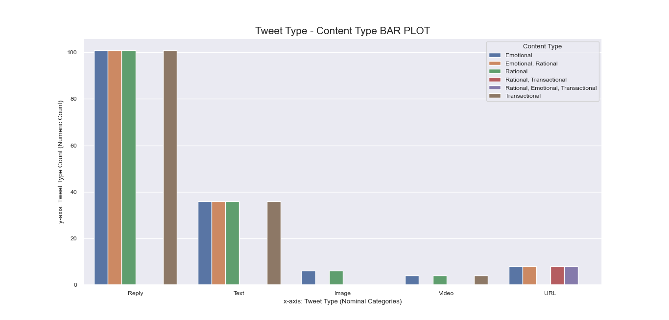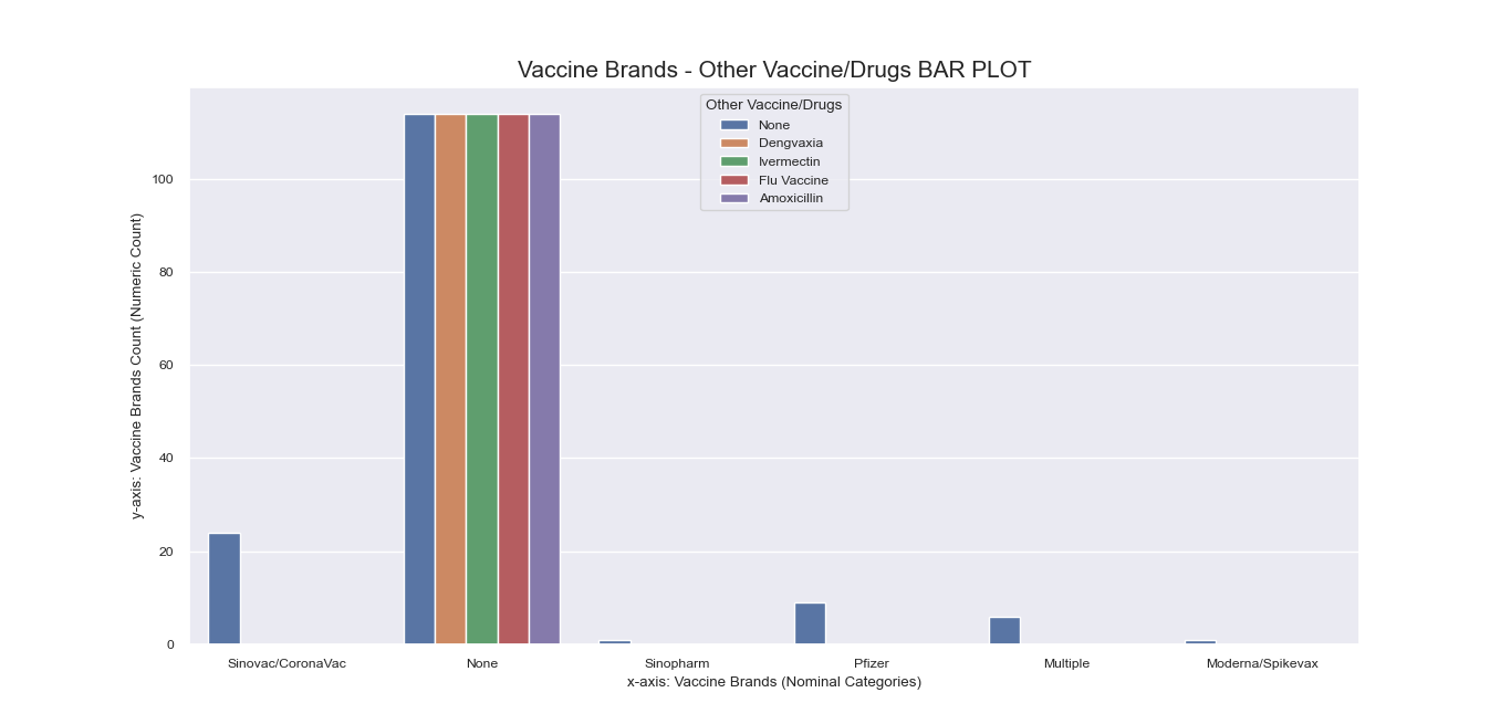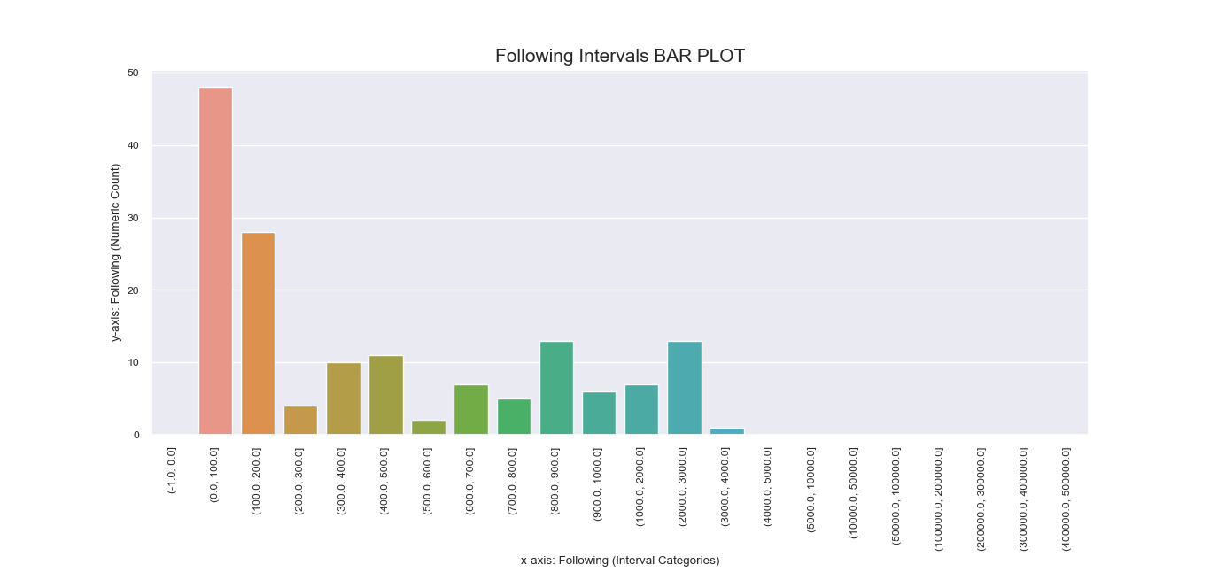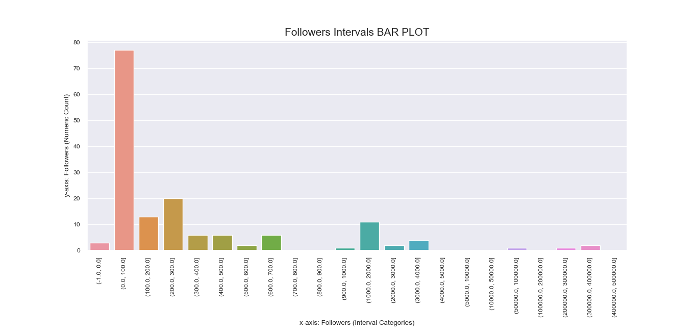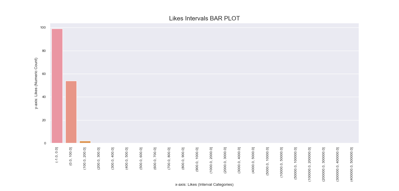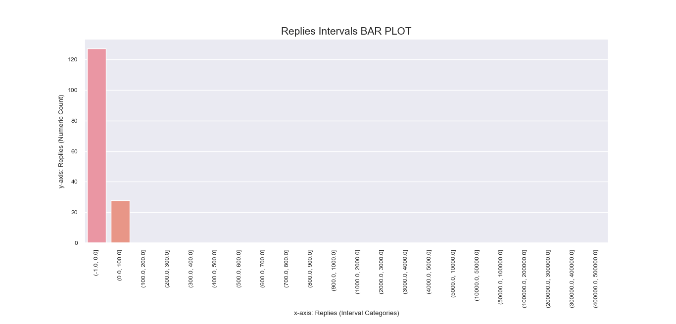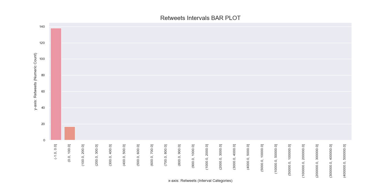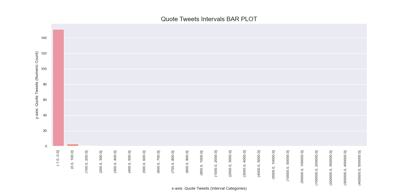

Another attempt to visualize and interpret categorical features in our dataset was
made possible using Seaborn barplot() method. This was first applied
to individual nominal data columns to generate imagery that describe their values and frequency.
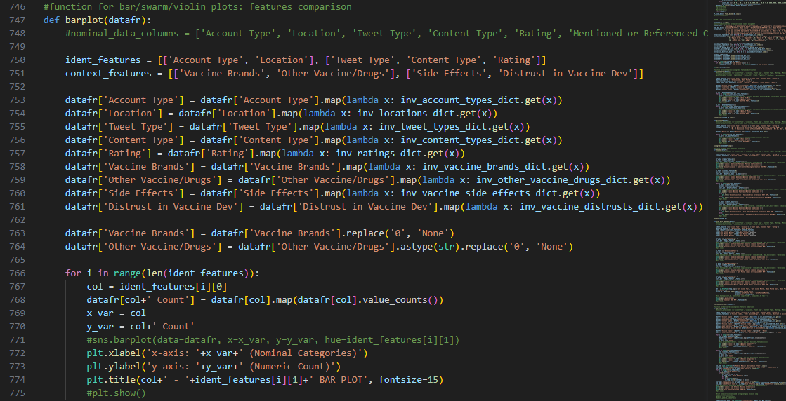
Dictionaries that were instantiated earlier in this step were
implemented for decoding the categorical values during the plotting process and transforming the numeric
points to labels that readers can comprehend.
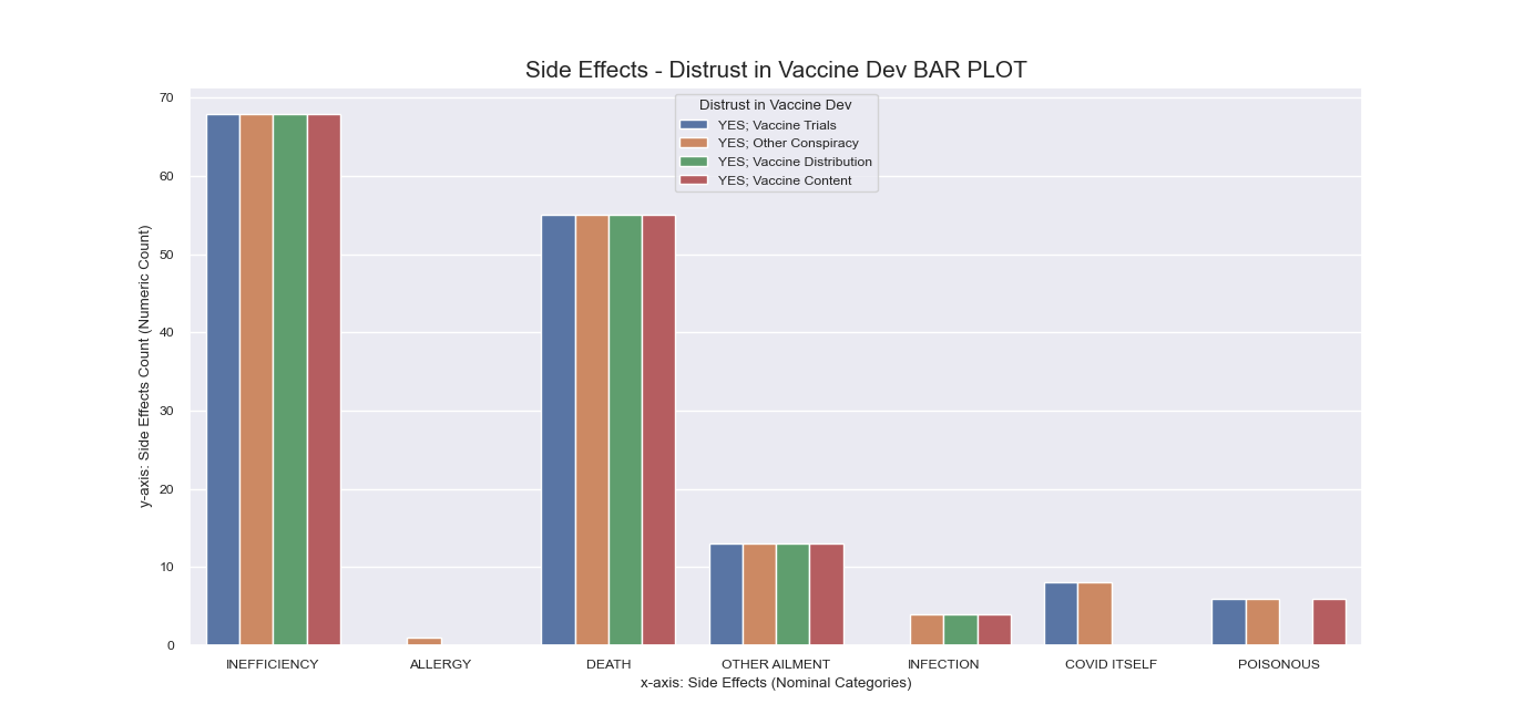
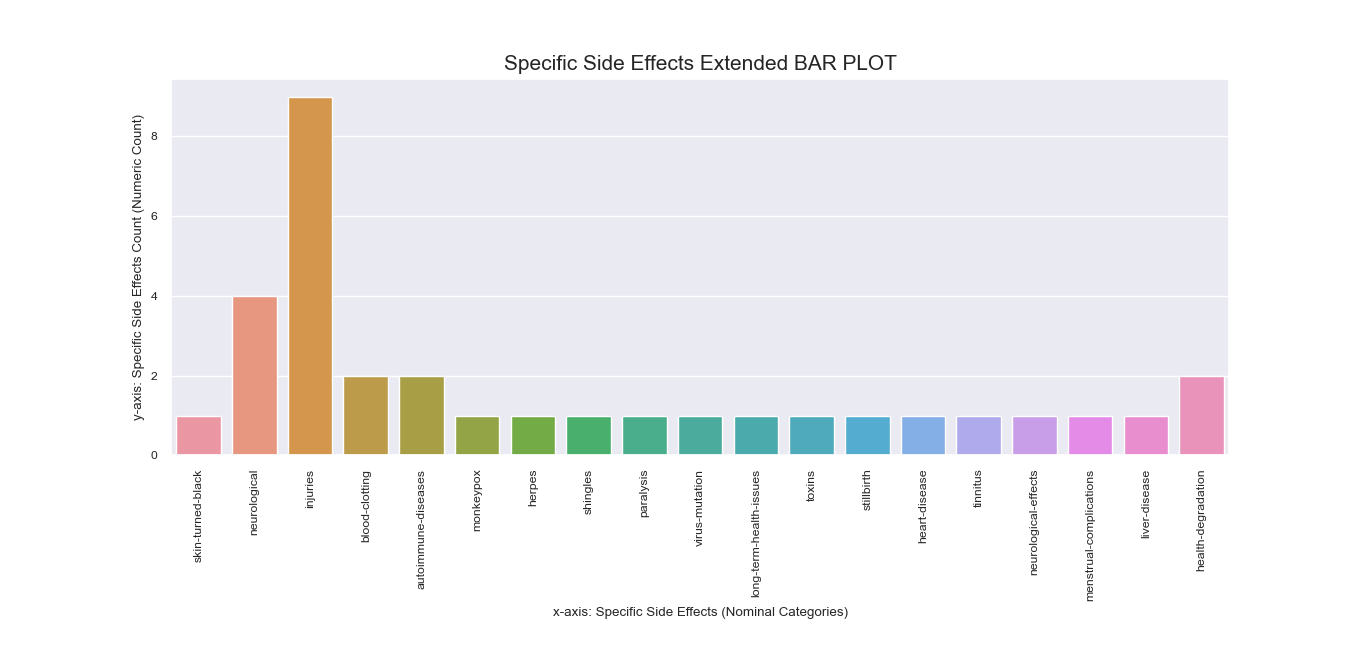
Note that during earlier process, the column of ‘Peddled Medical Adverse Side
Effects’ was encoded differently than other features such that the numeric representation of some of its
rows had more than one value in the form of number sequences.
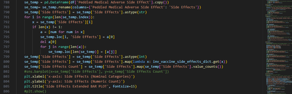
To address the unique encoding of the ‘Side Effects’ feature, we
created a separate bar plot for it that has more rows than the original dataframe to accommodate entries
that fall under more than one category
Unlike other features that may take more than label, the ‘Side Effects’ column must be specific for each
instance of mentioned side effect since it is indicative of underlying context that we need to discover for
our research question.
Again, decoding dictionaries were put to use upon plotting the total counts for the labels in this
column, which were obtained using value_counts() and were recorded in
a new column in the dataframe copy passed to the function.
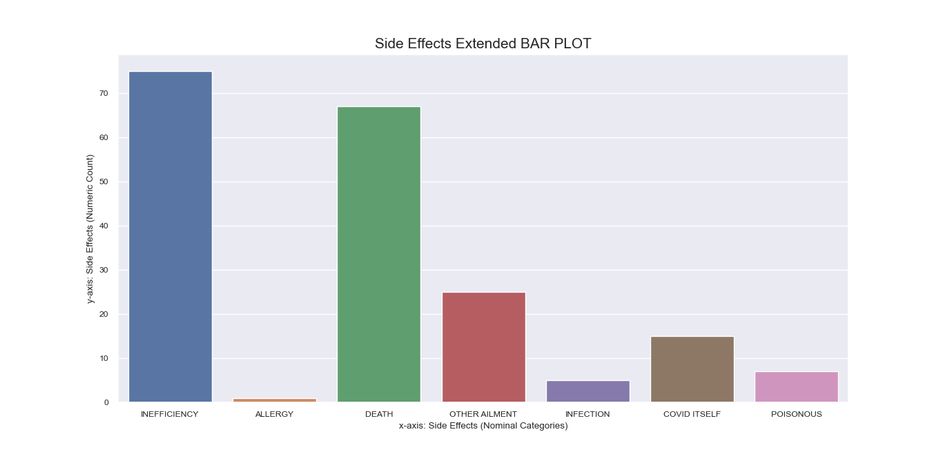
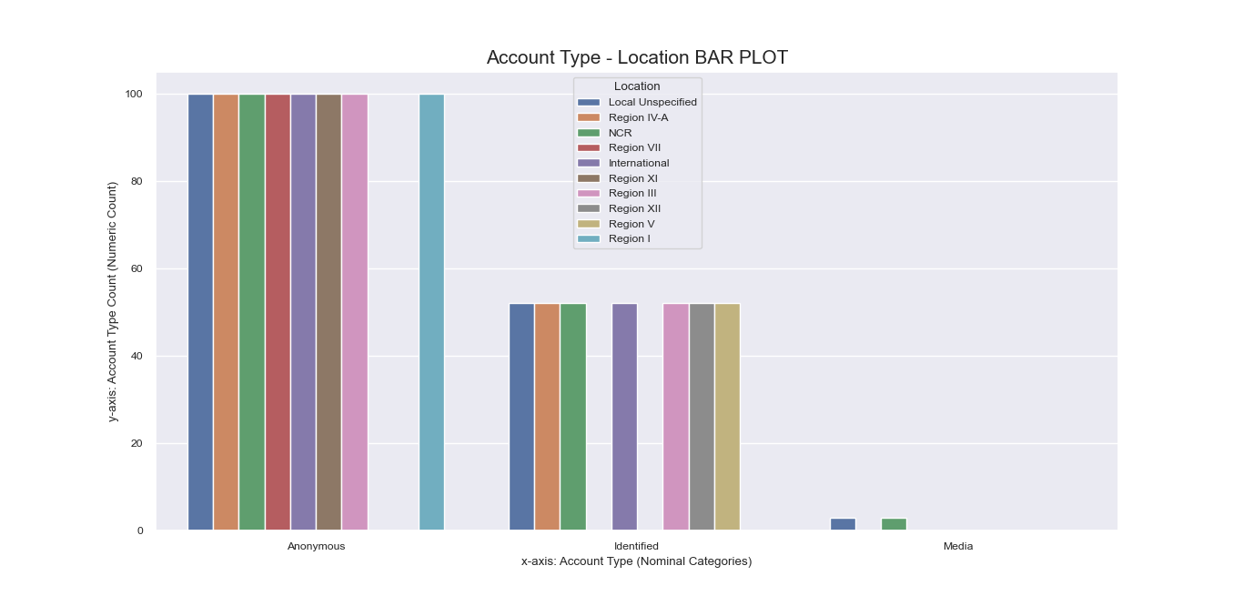
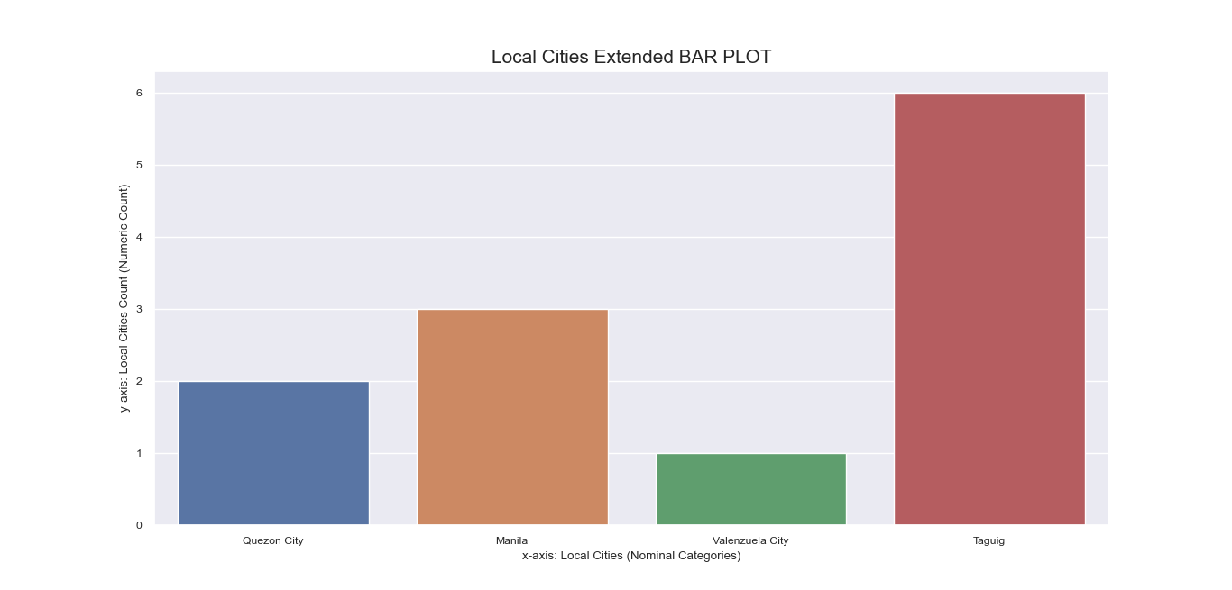
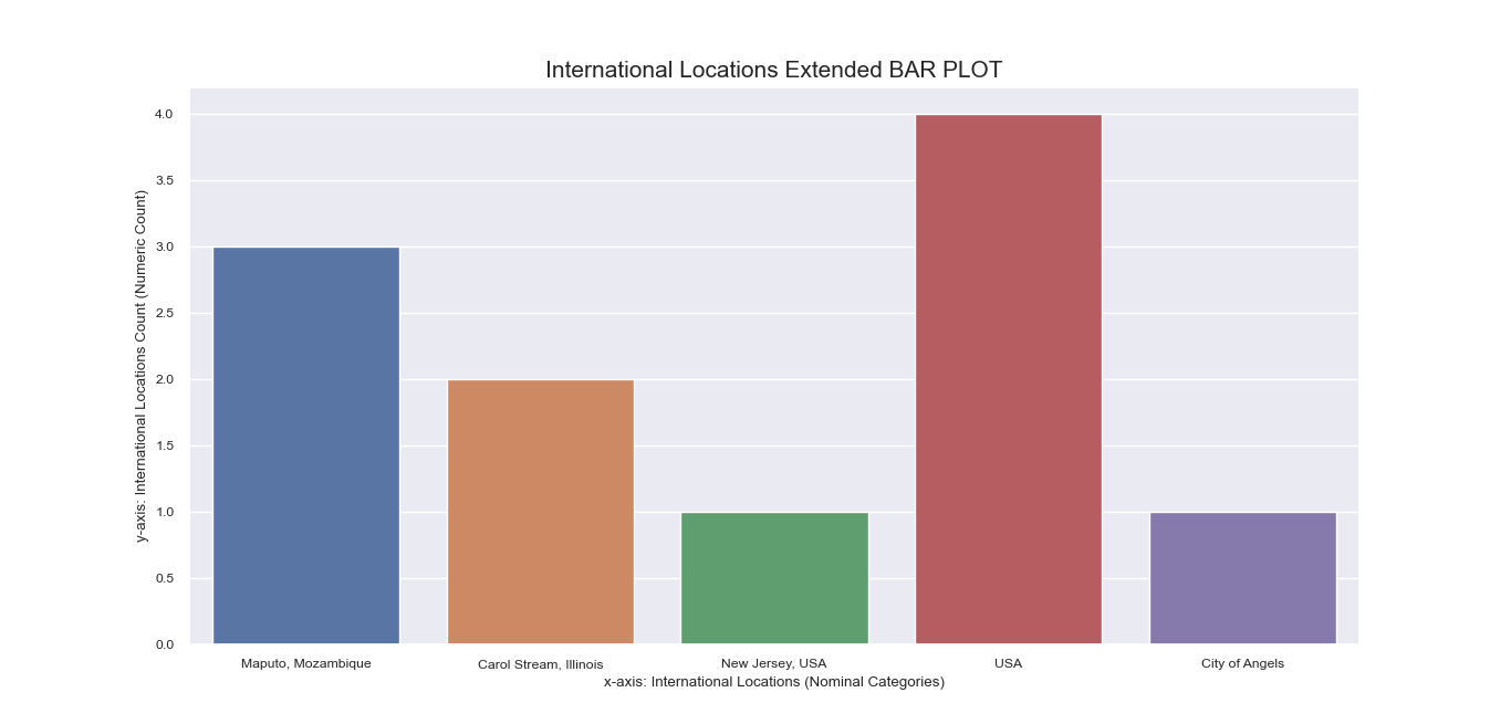
Referring again to the encoding step done beforehand, recall that
some nominal features have inherent sub-labels pertinent to specific local cities and international
locations for ‘Location’, and particular side effects for ‘Peddled Medical Adverse Side Effect’.
To get a more comprehensive visualization of our dataset, we also made bar plots
for these sub-labels:
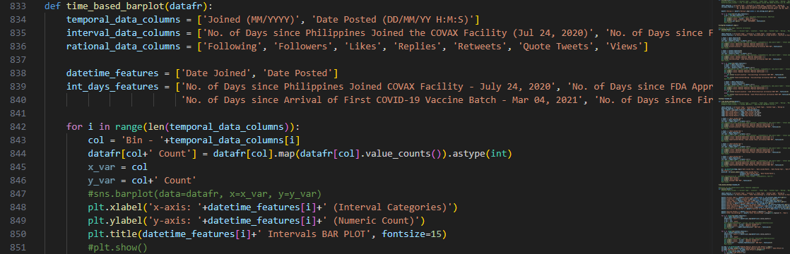
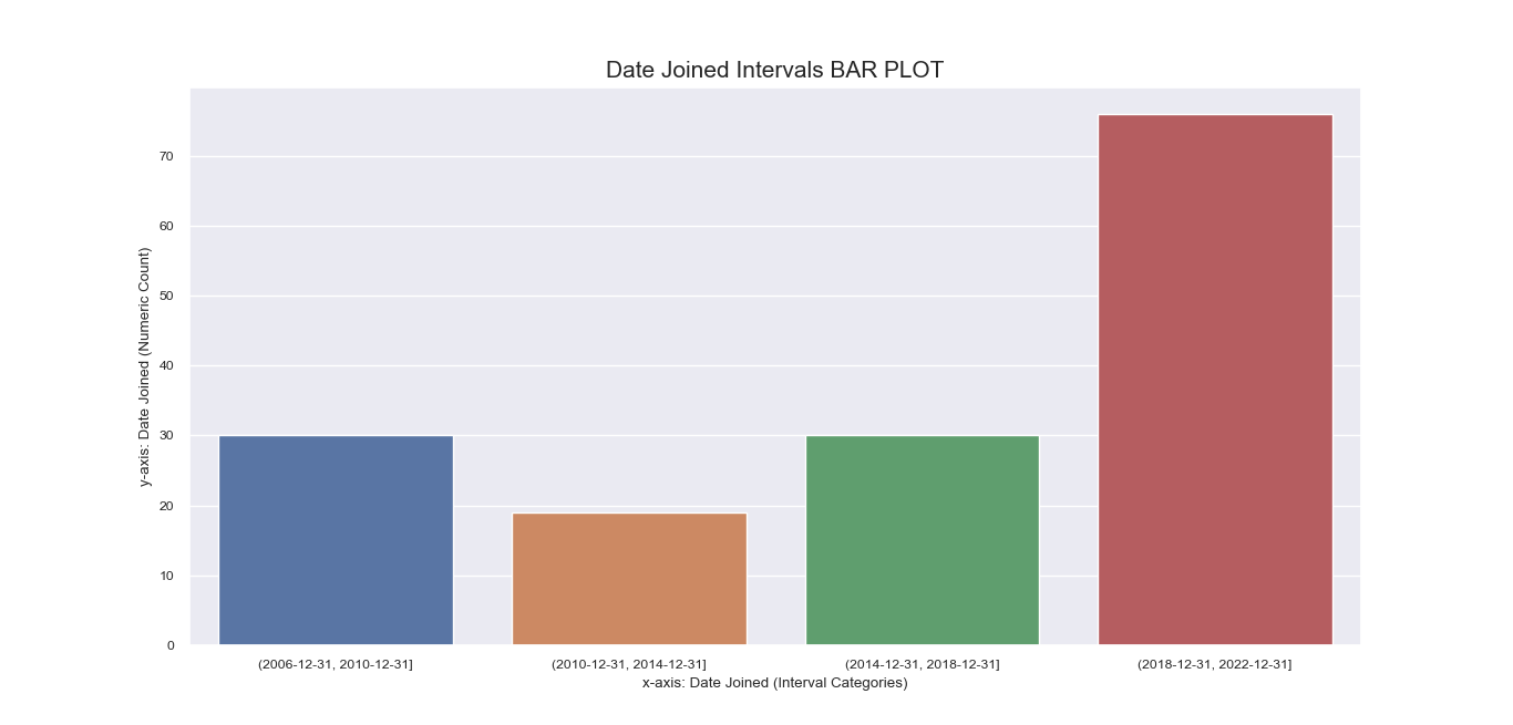
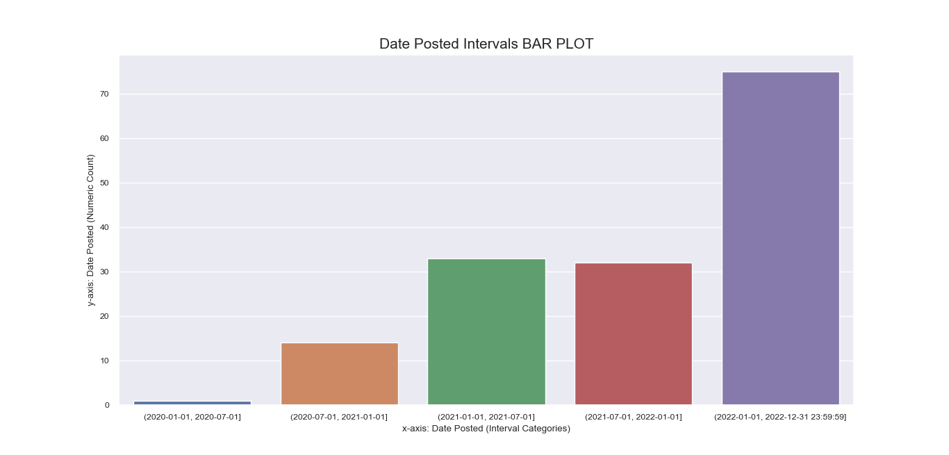
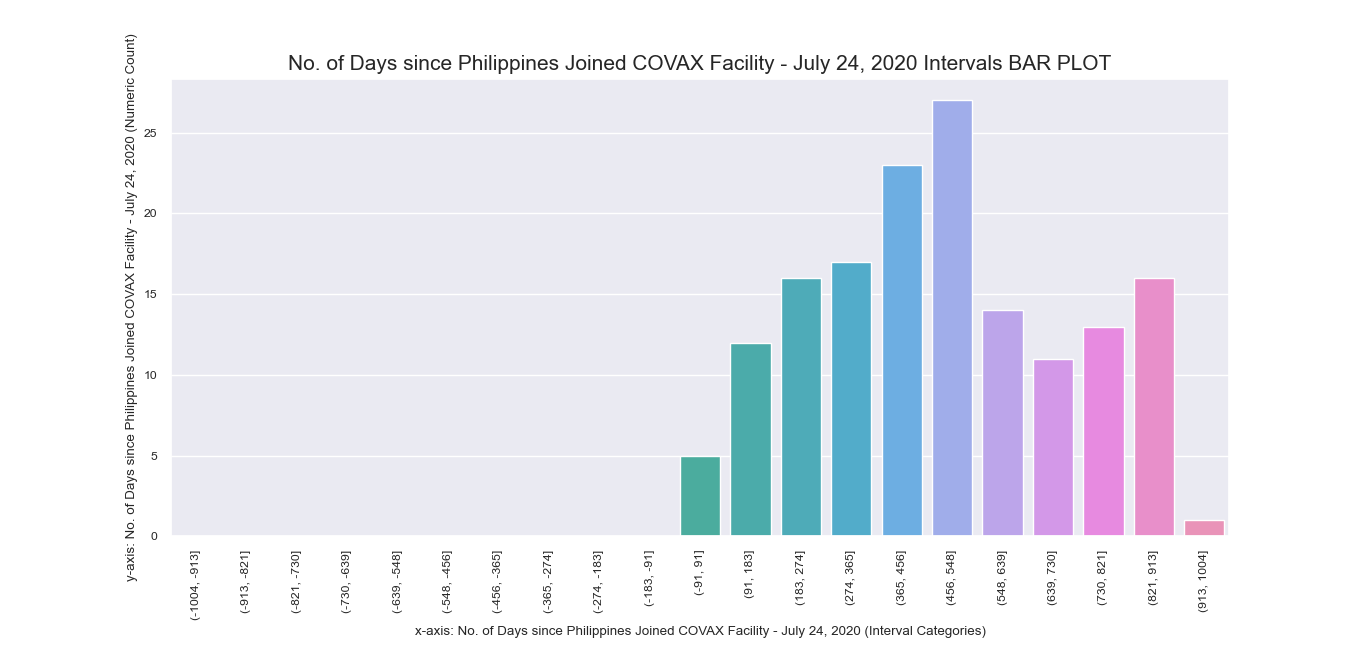
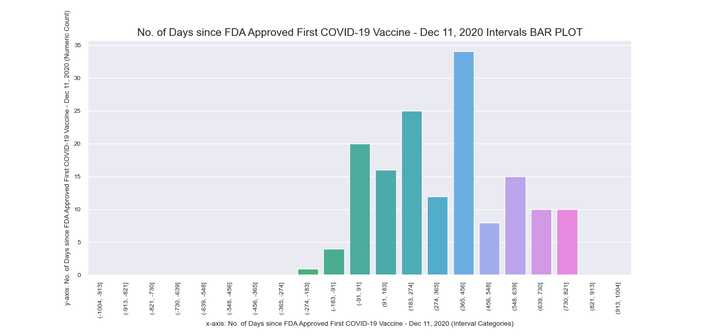
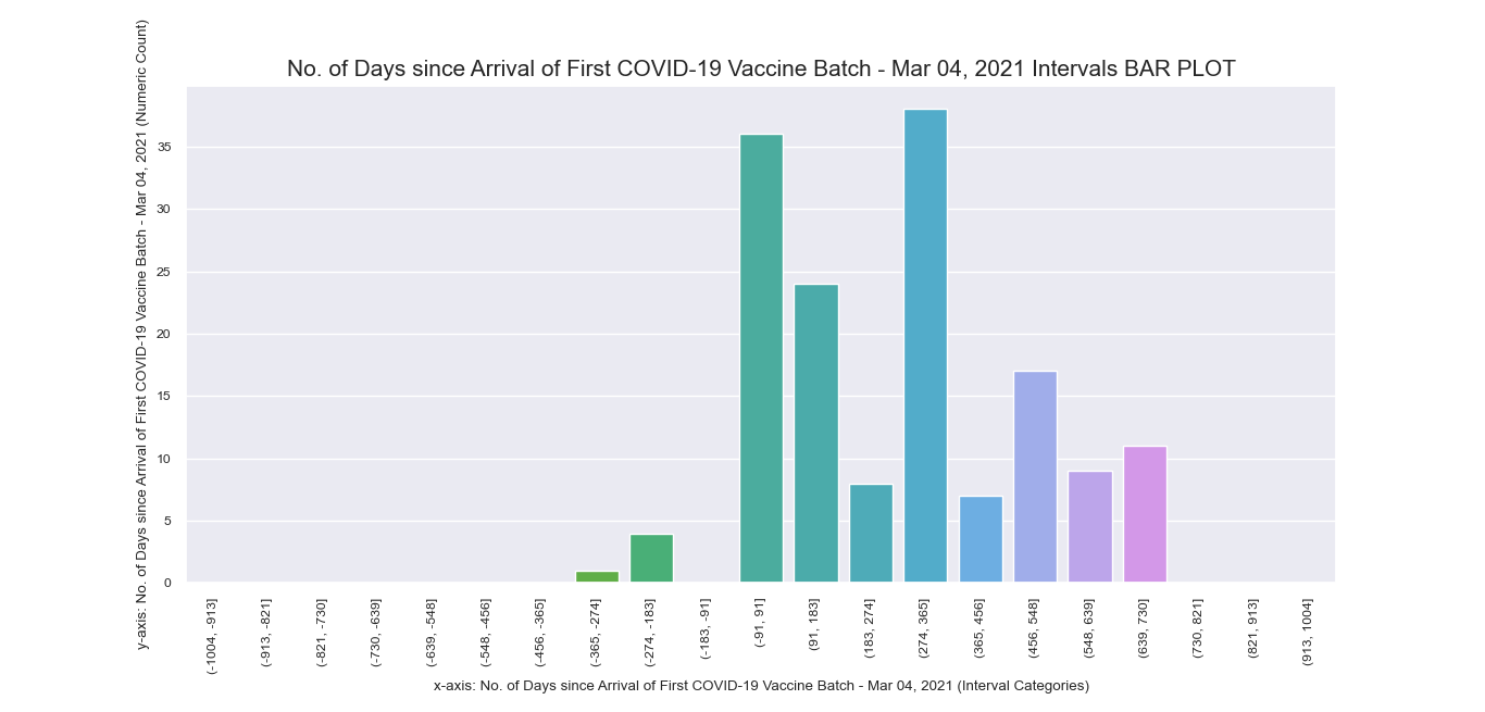
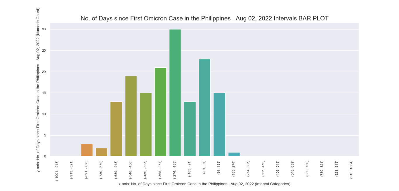
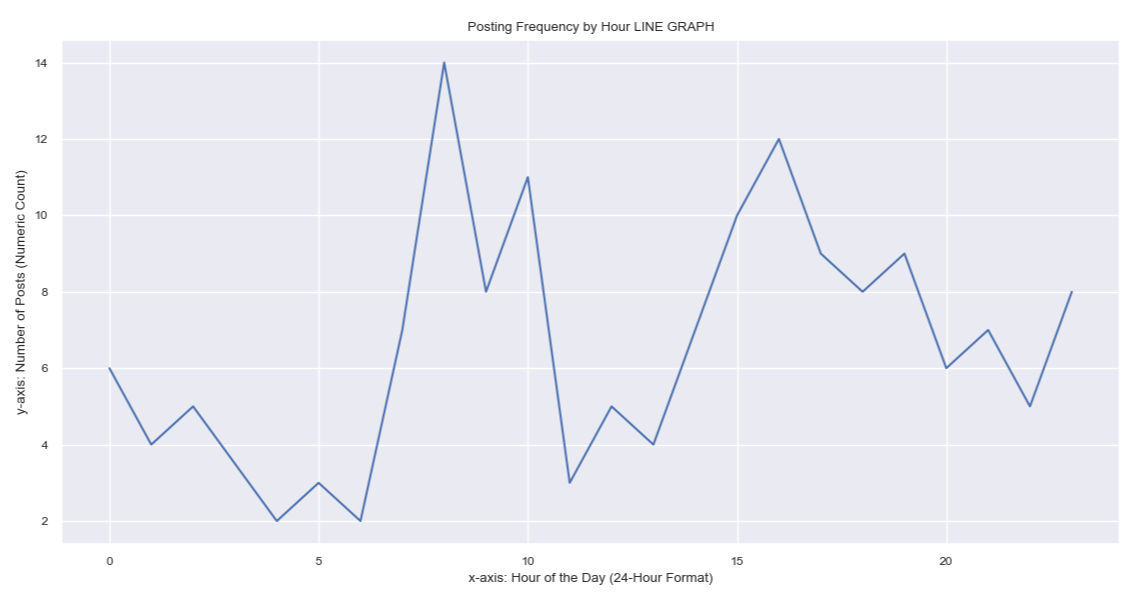
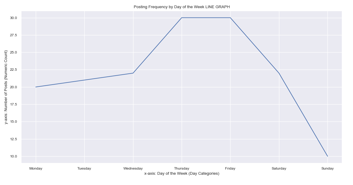
Seeing the significance of time series analysis for this research endeavor, we
also applied the interpolated values of our data points to arrive at an imagery of trends pertinent to
posting time of tweets.
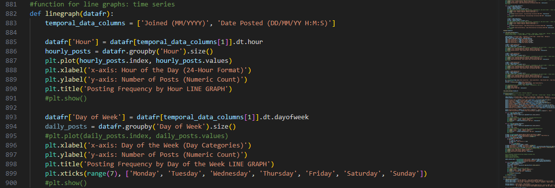
We wanted to identify the trends for hours of the day and days of the
week during which the tweets were posted over the course of the data gathering window.
From the DateTime dtype features, we extracted the values that
correspond to hours and days. Later, they were added to new columns and used as pivots for counting tweets
that match with the same posting DateTime values.
With the aid of Matplotlib, the labels of the axes were also adjusted accordingly.