

Although we already handled missing values during pre-processing, applying
interpolation methods shall allow us to come up with better, continuous plots in later segments.
The function linear_interpolator() takes the features that have
missing quantitative data or handled zero values to apply linear interpolation:
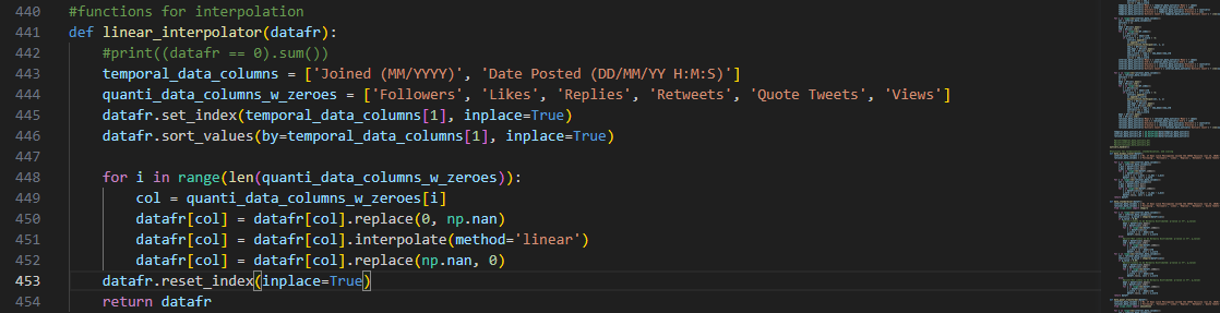
To integrate time-dependency, the index of the dataframe copy that
will store the interpolated result is shifted using the 'Date Posted DD/MM/YY H:M:S’ feature.
Each numeric column with handled zeroes is then passed as an argument to Python library’s built-in interpolate() method to fill in the data point gaps using neighboring
data points.
Another method of interpolation is the use of cubic splines through the function
cubic_spline_interpolator() that also shifts the index of the
dataframe copy to put emphasis on time-dependency:
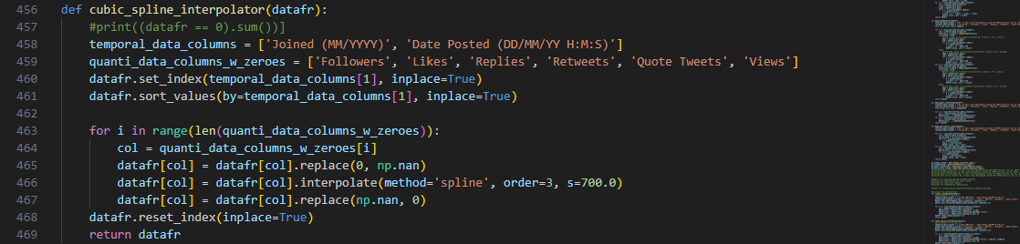
Other than the method parameter, there are additional arguments for
spline interpolation using Python’s built-in libraries.
The ‘order’ dictates that a cubic polynomial will be used to divide the data points into smaller
intervals. The resulting piecewise polynomials will then be used to fit a curve.
Ultimately, a smoothing curve parameter ‘s’ is required to control the tension or flexibility of the
curve itself. The higher it is, the higher the emphasis on overall trend will be.
A trade-off, however, is that the higher ‘s’ value might result in a curve that does not exactly fit the
data points. Thus, it cancels out variability in our dataset.
And for the third interpolation method, the polynomial_interpolator() is a
function that attempts to fit a polynomial that passes through all of our data points for each
feature.
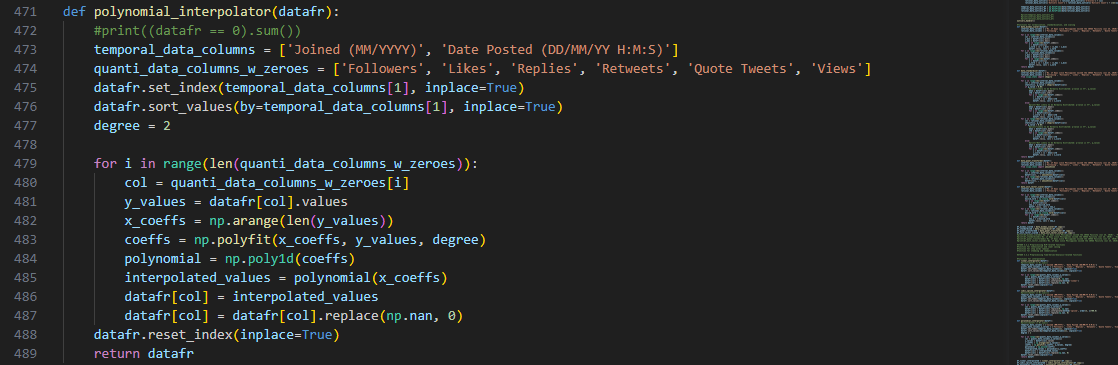
Naturally, this approach requires two separate arrays for the
coefficients and values of the polynomial to be fitted.
As implemented in previous methods, the temporal data for the posting timestamps of the tweets was used
as the independent variable.
Then, the data points in each column serve as the y-values in the resulting range of the polynomial
function.
Python’s NumPy poly1d() method creates an object from the
obtained polynomial from polyfit(), which returns an array of
coefficients that best fits the data points.
As for the polynomial’s degree 2, it shall allow us to arrive at a function that will balance both the
individual data points and capture some of the underlying complex trends.
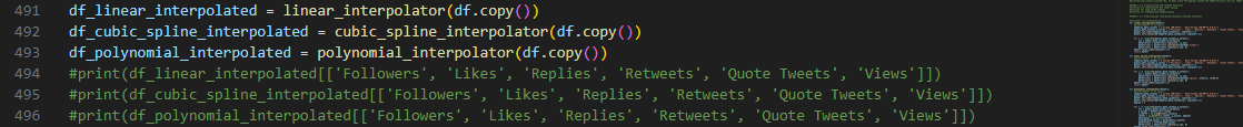
Similar with the scaling step, copies of the original dataframe were used to save
the interpolated values for later analysis and plotting. To check the result, print() method was applied:
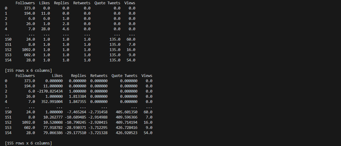
Notice that there are trailing zeroes for the results of both linear
and spline interpolation methods. This is due to the fact that there are valid zero values in our original
dataset.
Since linear interpolation relies on neighboring values to fill in the missing data points, the presence
of multiple zeroes was also manifested in the resulting interpolated features.
As for cubic spline interpolation, the trailing zeroes represent a flat region rather than a curve that
fits the data points. This simply means that there is a constant trend certain features and not that
interpolation did not work.
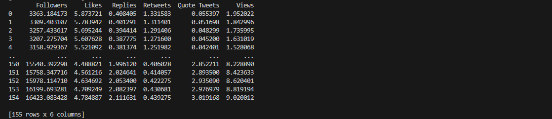
Notice that for the result of polynomial interpolation, the value of
the data points are significantly different from the original dataset.
This is due to the nature of the curve fitting process that requires the polynomial function to pass
through the data points as close as possible.
As a result, the coefficients are adjusted as deemed necessary and the interpolated result provide
estimated values to capture overall trends.
The second portion of time series analysis enables us to summarize our dataset
using discrete bins that groups the data points for a more inclusive feature analysis and easier
visualization.
In previous sections, it was emphasized that we divided the features of our dataset into groups
according to the nature or level of the data points.
We took this grouping into account when devising the interval bins for this segment of our data
exploration, such that each group of features has its own set of bins.
Python Pandas cut() method was the primary tool employed to
achieve the creation of succeeding fixed bins for the discretization of our dataset’s numerical and temporal
values.
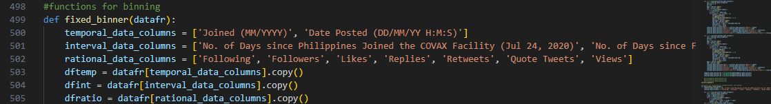
For each group of features, a designated copy of the original dataframe is
instantiated for the binning process to avoid transformation errors.
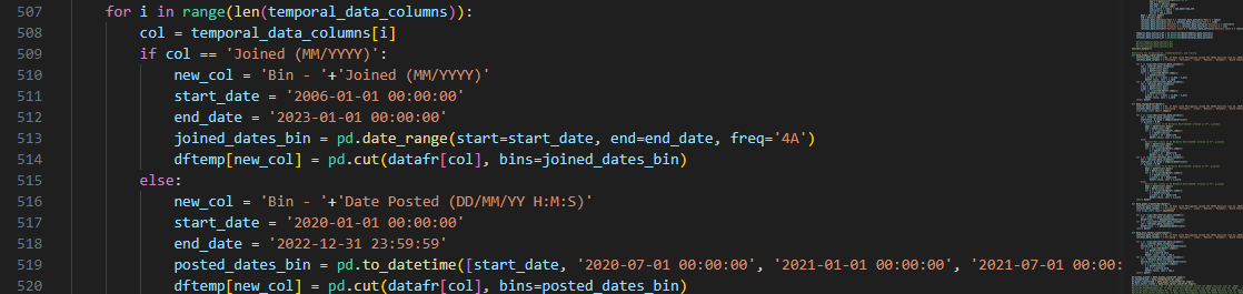
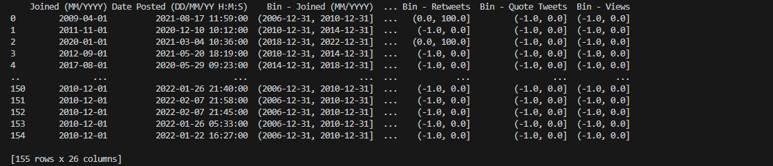
The temporal data columns pertain to two features that identify the account who
posted a tweet and when it was posted.
We used two different sets of fixed bins for the temporal data since either of them pertain to different
aspects of the data i.e., the account and the tweet itself.
For the 'Joined (MM/YYYY)’ feature, we decided to divide the time series according to intervals of four
years starting from when Twitter was first released. This shall help us categorize an account according to
how old or new it is.
'Date Posted (DD/MM/YY H:M:S)' feature is then divided into intervals of six months. The initial
interval bounds the first six months of the pandemic, succeeding six months, then the last six of months of
2022.
Built-in pandas utilities, pd.date_range and pd.to_datetime were used as measures to ensure that the intervals are
compared with the right type of numerical data values before assigning their respective IntervalIndex dtype
value.

Columns containing interval data are features that pertain to number of days in
connection with significant COVID-19-related events that took place over the course of the
pandemic.
To attain a more uniform comparison and analysis, their fixed bins are bounded between intervals of
three months or ninety days.
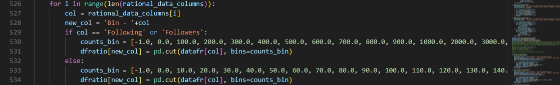
The last group of columns apply to characteristics of the gathered tweets
themselves and are counts that relate to their influence in the social media platform.
Both 'Following' and 'Followers' columns are attributes that identify the account owners so we created
separate fixed bins for these, which represent higher magnitude than other features in this group.
As for the rest of the features, their fixed bins are bounded between intervals of ten counts, including
the absolute zero so the starting value is open around negative one (-1).
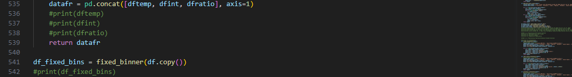
Upon executing the main binning methods, all of the copies of binned columns are
then concatenated into one dataframe for later use using Pandas pd.concat().
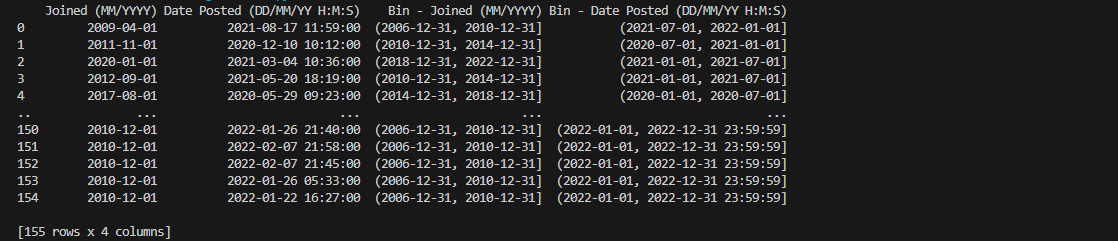
The columns containing temporal data, as observable using the straightforward
print() method, now have their corresponding interval values ranging
from dates and timestamps instantiated in their respective fixed bins.
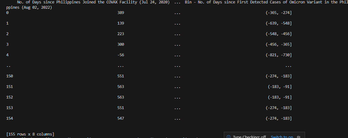
Columns encompassing numbers of days depending on particular COVID-19-related
events also display their matching interval bins. Notice that the columns containing IntervalIndex dtype are also renamed accordingly.
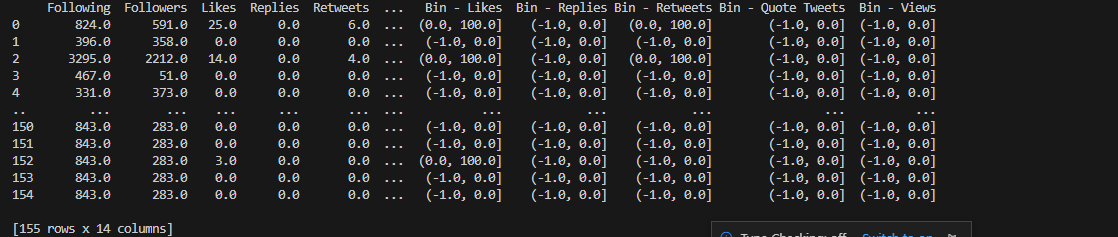
Lastly, the rational data points and their fitting attributes are also exhibiting
suitable fixed bin values that properly categorizes the tweet’s influence based on the feature count’s
magnitude.
Combining all the binned copies of the main dataframe, as seen above, shall
prepare us for a more uniform and systematic analysis in latter segments of our project.
This will serve as one separate dataframe that we can utilize further to arrive at more comprehensive
plots.